Alternate strip? 1914 style

This unofficial St Kilda Saints fan forum is for people of all ages to chat Saints Footy and all posts must be respectful.

Moderators: Saintsational Administrators, Saintsational Moderators

Post Reply
User avatar
saintbrat
Saintsational Legend
Posts: 44575
Joined: Tue 09 Mar 2004 4:11pm
Location: saints zone
Has thanked: 6 times
Been thanked: 188 times

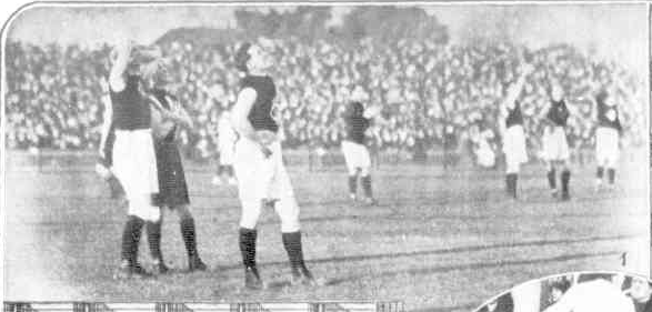
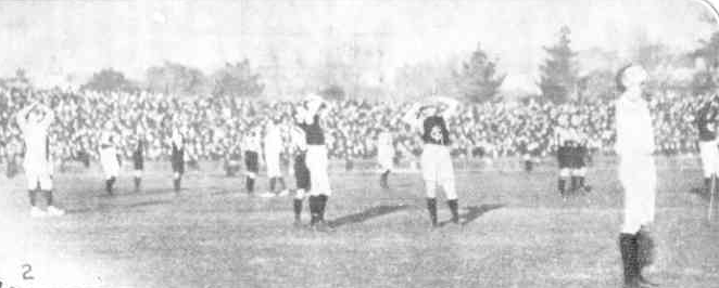
Alternate strip? 1914 style

Post: # 1595869Post saintbrat »

Image
Image

Rhett Bartlett ‏@rhettrospective
Amazing!
StK v Carl at Junction Oval 1914 interrupted as players watch Maurice Guillaux perform aeroplane display


I enjoy following Rhett Bartlett on twitter as he has a twist on his view of football - much like his father- and is into history


StReNgTh ThRoUgH LoYaLtY
Rejoicing in hope, patient in tribulation, continuing steadfastly..!!
Image
MEMBERSHIP 2014 31,134 Membership 2015 32,746 MEMBERSHIP 2016 - 38,101
MEMBERSHIP 2017 42,095 , Membership 2018 46,998
MEMBERSHIP 2019 43,106 http://saintsational.net/viewtopic.php? ... 9#p1816890
MEMBERSHIP 2020 48,588 http://saintsational.net/viewtopic.php?f=1&t=100107
User avatar
thequarry
Club Player
Posts: 391
Joined: Fri 06 Jul 2007 1:17am
Location: Melbourne
Has thanked: 2 times

Re: Alternate strip? 1914 style

Post: # 1596363Post thequarry »

A black version of our current clash would be a great home strip. It's not just the actual design of the strip, but the fact that it's based on a jumper we wore over 100 years ago (1893-1914, post-original candy stripe and pre-red/yellow/black WW1 version) that makes it even better. Also shows up how poorly thought-out and ridiculous a lot of modern designs are.

The closest I guess we have to a modern version of the jumper in the shot as a permanent design is when we wore black shorts with the candy stripe in a practice match against Sydney in 2006:
Image

Interestingly, for a period when we originally wore this jumper, some players wore a similar-but-different version in the 1906-1909 seasons which probably had a lot more red and white, and concurrently with the "default" strip.

This is a 1906 photo which is on Boyles Football Photos (http://www.boylesfootballphotos.net.au/HomePage):
Image

Mero who operates http://footyjumpers.com/ thinks it translates into something like this:

Image

Which, given the bigger presence of red and where it's placed throughout the jumper would actually provide for a higher-contrasting clash jumper than we've had for the past decade or so.
Image
st.byron
Saintsational Legend
Posts: 10598
Joined: Tue 14 Jun 2005 7:04pm
Location: North
Has thanked: 1011 times
Been thanked: 1055 times

Re: Alternate strip? 1914 style

Post: # 1596370Post st.byron »

thequarry wrote:A black version of our current clash would be a great home strip. It's not just the actual design of the strip, but the fact that it's based on a jumper we wore over 100 years ago (1893-1914, post-original candy stripe and pre-red/yellow/black WW1 version) that makes it even better. Also shows up how poorly thought-out and ridiculous a lot of modern designs are.

The closest I guess we have to a modern version of the jumper in the shot as a permanent design is when we wore black shorts with the candy stripe in a practice match against Sydney in 2006:
Image
Love that candy stripe. One of my favourite jumpers.


BigMart
Saintsational Legend
Posts: 13622
Joined: Sat 22 Mar 2008 6:06pm
Been thanked: 1 time

Re: Alternate strip? 1914 style

Post: # 1596410Post BigMart »

hated the candy strpie.... ugly and looked like an american 50s carnival/fair type uniform. hardly imposing.

i love the traditional jumper

and the inverse as the away jumper... white back

that simple


User avatar
thequarry
Club Player
Posts: 391
Joined: Fri 06 Jul 2007 1:17am
Location: Melbourne
Has thanked: 2 times

Re: Alternate strip? 1914 style

Post: # 1596449Post thequarry »

BigMart wrote:hated the candy strpie.... ugly and looked like an american 50s carnival/fair type uniform. hardly imposing.

i love the traditional jumper

and the inverse as the away jumper... white back

that simple
That's definitely the dream.

I'd secretly love red numbers on a white back to accentuate the contrast with darker teams but I doubt the club/manufacturers would ever do it.


Image
Post Reply