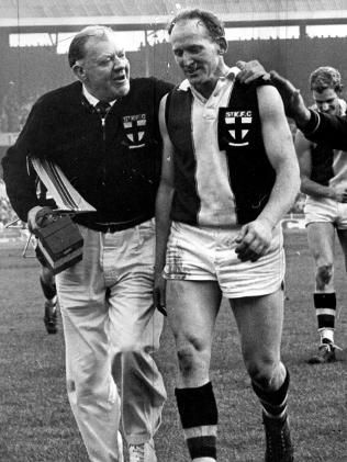
Our Club Crest
Moderators: Saintsational Administrators, Saintsational Moderators
-
- Saintsational Legend
- Posts: 11354
- Joined: Thu 11 Mar 2004 12:57am
- Location: South of Heaven
- Has thanked: 1349 times
- Been thanked: 462 times
Our Club Crest
What a magnificent symbol it is. We have such powerful design of heraldry.
It needs to be restored back to its original size and sewn on (not transferred or printed) onto player guernseys, just like how they used to. I hate how it's been diminished in recent years.
People say "oh, it's only a jumper...". Shame on them! It effing matters! This 21st century ho-hum BS apathy can be firmly discarded. If we're going to play badly every week, we could at least look more respectable in our attire to add some redemption.
Curb your enthusiasm - you’re a St.Kilda supporter!!
- saintbrat
- Saintsational Legend
- Posts: 44575
- Joined: Tue 09 Mar 2004 4:11pm
- Location: saints zone
- Has thanked: 6 times
- Been thanked: 188 times
Re: Our Club Crest
in the background in this interview with Ameet baines for Indian TV is a code of belief
at the 3.23 minute mark
StReNgTh ThRoUgH LoYaLtY
Rejoicing in hope, patient in tribulation, continuing steadfastly..!!
MEMBERSHIP 2014 31,134 Membership 2015 32,746 MEMBERSHIP 2016 - 38,101
MEMBERSHIP 2017 42,095 , Membership 2018 46,998
MEMBERSHIP 2019 43,106 http://saintsational.net/viewtopic.php? ... 9#p1816890
MEMBERSHIP 2020 48,588 http://saintsational.net/viewtopic.php?f=1&t=100107
-
- Saintsational Legend
- Posts: 4673
- Joined: Tue 22 Jan 2008 5:41pm
- Has thanked: 425 times
- Been thanked: 518 times
Re: Our Club Crest
Yes and it's been my beef over the years when the Club puts some sponsors logo above our crest. I wrote to the Club a number of times about that betting group having their logo above our crest, telling them how disrespectful this was. Glad that betting mob and it's tainted money have gawn.Sainternist wrote:What a magnificent symbol it is. We have such powerful design of heraldry.
It needs to be restored back to its original size and sewn on (not transferred or printed) onto player guernseys, just like how they used to. I hate how it's been diminished in recent years.
People say "oh, it's only a jumper...". Shame on them! It effing matters! This 21st century ho-hum BS apathy can be firmly discarded. If we're going to play badly every week, we could at least look more respectable in our attire to add some redemption.
-
- Saintsational Legend
- Posts: 11354
- Joined: Thu 11 Mar 2004 12:57am
- Location: South of Heaven
- Has thanked: 1349 times
- Been thanked: 462 times
Re: Our Club Crest
A shame it was overexposed in the shot. I don't mean to be pedantic, but this Indian Television network seems a little amateurish with it's production values. No proper microphone use from the interview footage in front of the Team of the Century painting.saintbrat wrote:in the background in this interview with Ameet baines for Indian TV is a code of belief
at the 3.23 minute mark
Curb your enthusiasm - you’re a St.Kilda supporter!!
-
- Saintsational Legend
- Posts: 11354
- Joined: Thu 11 Mar 2004 12:57am
- Location: South of Heaven
- Has thanked: 1349 times
- Been thanked: 462 times
Re: Our Club Crest
Yeah, but you follow a plastic hockey team called the Avalanche.Spinner wrote:I think I'm happy with not having a sewn on emblem on a silky screen printed jumper. Happy with the size too, looks good aesthetically...
Curb your enthusiasm - you’re a St.Kilda supporter!!
- 8856brother
- Saintsational Legend
- Posts: 4374
- Joined: Wed 14 Sep 2011 2:58pm
- Location: Twin Peaks
- Has thanked: 1 time
- Been thanked: 1 time
Re: Our Club Crest
Agree 100%. It should stand out like the old CFC and FFC. It's lost on our jumper now. Geelongs is as big as ours now and its not part of their history. You wouldn't even know if it was gone. Bring it back, big and proud.Sainternist wrote:What a magnificent symbol it is. We have such powerful design of heraldry.
It needs to be restored back to its original size and sewn on (not transferred or printed) onto player guernseys, just like how they used to. I hate how it's been diminished in recent years.
People say "oh, it's only a jumper...". Shame on them! It effing matters! This 21st century ho-hum BS apathy can be firmly discarded. If we're going to play badly every week, we could at least look more respectable in our attire to add some redemption.
_______________________________________________________________________
"Don't argue with an idiot. He will drag you down to his level and beat you with experience."
- Dave McNamara
- Saintsational Legend
- Posts: 5862
- Joined: Wed 21 Sep 2011 2:44pm
- Location: Slotting another one from 94.5m out. Opposition flood? Bring it on...! Keep the faith Saintas!
- Has thanked: 100 times
- Been thanked: 112 times
Re: Our Club Crest
What Sainternist, Loris and Bro said!!!
If this site does ever become in need of cotributing writers, well, we have some beauties.
Now that's a wonderful piece of writing from our Sainterist!We have such powerful design of heraldry - Sainternist.
If this site does ever become in need of cotributing writers, well, we have some beauties.
It's Dave, man. Will you open up? I got the stuff with me! -------Who?
Dave, man. Open up ------------------------------------------ -----Dave???
Yeah, Dave. ---------------------------------------------------------Dave's not here.
http://www.youtube.com/watch?v=QOiG1hAr ... detailpage
Dave, man. Open up ------------------------------------------ -----Dave???
Yeah, Dave. ---------------------------------------------------------Dave's not here.
http://www.youtube.com/watch?v=QOiG1hAr ... detailpage
- thequarry
- Club Player
- Posts: 391
- Joined: Fri 06 Jul 2007 1:17am
- Location: Melbourne
- Has thanked: 2 times
Re: Our Club Crest
Greg Westaway said at the 2011 AGM that the AFL has rules on how big the club logos can be on the jumper, although I think this meant more when they're "placed" on the top of a jumper design and near the sponsor logos (as ours and other clubs' are), rather than forming a part of the jumper itself (see the 2007/08 clash jumper and 2010 NAB Cup/Training jumper).
The thing is, I wonder if the old-style simplified logo in the photo wouldn't quite classify strictly as the club's logo, and could be brought back to that original size. I think it would be fantastic. It was something unique we had in the VFL/AFL competition until the AFL tightened the rules, and now it's become a more template-based feature that several other clubs now implement also.
I actually posted this recently and said the same thing, but I think somewhere between our current home jumper and the 2006 Heritage Round jumper would be ideal:
- Spinner
- Saintsational Legend
- Posts: 8502
- Joined: Sat 02 Dec 2006 3:40pm
- Location: Victoria
- Has thanked: 185 times
- Been thanked: 133 times
Re: Our Club Crest
Boom!Sainternist wrote:Yeah, but you follow a plastic hockey team called the Avalanche.Spinner wrote:I think I'm happy with not having a sewn on emblem on a silky screen printed jumper. Happy with the size too, looks good aesthetically...
-
- Saintsational Legend
- Posts: 11354
- Joined: Thu 11 Mar 2004 12:57am
- Location: South of Heaven
- Has thanked: 1349 times
- Been thanked: 462 times
Re: Our Club Crest
The dimensions on the guernsey in above photo are close to perfect, for mine. Would love to see something like it brought back as our home guernsey.thequarry wrote:Greg Westaway said at the 2011 AGM that the AFL has rules on how big the club logos can be on the jumper, although I think this meant more when they're "placed" on the top of a jumper design and near the sponsor logos (as ours and other clubs' are), rather than forming a part of the jumper itself (see the 2007/08 clash jumper and 2010 NAB Cup/Training jumper).
The thing is, I wonder if the old-style simplified logo in the photo wouldn't quite classify strictly as the club's logo, and could be brought back to that original size. I think it would be fantastic. It was something unique we had in the VFL/AFL competition until the AFL tightened the rules, and now it's become a more template-based feature that several other clubs now implement also.
I actually posted this recently and said the same thing, but I think somewhere between our current home jumper and the 2006 Heritage Round jumper would be ideal:
These rules imposed by the AFL sound like a pathetic quibble to me. I wonder in what context they were implemented. Perhaps there's a chance for it to be revised.
Thanks Dave! I try my best to add a little bit to the old "vernacular" whenever required.Dave McNamara wrote: Now that's a wonderful piece of writing from our Sainterist!
If this site does ever become in need of cotributing writers, well, we have some beauties.
Curb your enthusiasm - you’re a St.Kilda supporter!!
- Enrico_Misso
- Saintsational Legend
- Posts: 11662
- Joined: Tue 13 Jun 2006 12:11am
- Location: Moorabbin Chapter of The Royal Society of Hagiographers
- Has thanked: 315 times
- Been thanked: 720 times
Re: Our Club Crest
I've said it before.
Bring back the Crest.
It's an important part of our history.
Bring back the Crest.
It's an important part of our history.
The rest of Australia can wander mask-free, socialise, eat out, no curfews, no zoning, no police rings of steel, no illogical inconsistent rules.
They can even WATCH LIVE FOOTY!
- Junction Oval
- SS Life Member
- Posts: 2867
- Joined: Tue 30 Nov 2010 11:16am
- Been thanked: 19 times
Re: Our Club Crest
Yep. It's important to hang on to our history and the Logo is a vital part of that. It looks great and needs to be supported by those who count - the Saints supporters!!
We need to keep letting the Club know about these things. Newbies in our administration have no real feel for these historical aspects and are quick to institute change for the sake of change. They need to be reminded how the supporter base feels about our Logo
-
- Club Player
- Posts: 857
- Joined: Tue 30 Mar 2004 5:44pm
- Has thanked: 93 times
- Been thanked: 117 times
Re: Our Club Crest
Junction Oval wrote:Yep. It's important to hang on to our history and the Logo is a vital part of that. It looks great and needs to be supported by those who count - the Saints supporters!!
We need to keep letting the Club know about these things. Newbies in our administration have no real feel for these historical aspects and are quick to institute change for the sake of change. They need to be reminded how the supporter base feels about our Logo
+1
It's definitely shrunk to a now token level. Without doubt it needs to be bigger and more prominent. Do it!
- Spinner
- Saintsational Legend
- Posts: 8502
- Joined: Sat 02 Dec 2006 3:40pm
- Location: Victoria
- Has thanked: 185 times
- Been thanked: 133 times
Re: Our Club Crest
Surely a lot in this thread isn't serious? The logo is still there, it's not been removed or changed significantly.
Would you prefer each to be individually hand sewn on to remain authentic? Maybe we can make even less profit from our merchandise business.
-
- Club Player
- Posts: 202
- Joined: Tue 14 Feb 2012 2:25pm
Re: Our Club Crest
Come on Sainternist - you must be an old fogie (like me) - at least I grow with the times and think our current jumpers (home & away) are the best of them all.
By the way Sainternist, what sort of car do you drive - wouldn't be a 1952 Morris Minor would it?
Re: Our Club Crest
As a passionate Saints supporter, I too feel that the corporatisation of our game has lead to the demise of aesthetics of our club jumper.
Having suggested to the St Kilda Football club several years ago about the introduction of a heritage round to be played at least once where every year. Every club and umpire would wear there traditional club colours, which was shown early on when they brought in heritage round. I wanted this because I felt that the game was slipping away and I longed for the bygone eras where you had a sense of pride about your club.
It was meant in my mind at the time to resurrect the glory of our code and reinstate some pride. I am a firm believer with most people in the is discussion that our logo is barley visible to the eye now. This "logo" forms a big part of our jumper as shown in various historical pictures gone by. Just like a house in inner Melbourne can be heritage listed, so should our club logo!!
My recommendation to the football club would be simply to restore the club logo back to it's original size. It doesn't need to be sewn on, but large enough as depicted in the picture above.
I can't see it changing unless there is some sort of push from our supported base to bring it back, ie petition. (hint)
I do respect Eddie McGuire in one respect for pushing for his club to stick to the traditional stripes of the and not deviating from what makes Collingwood, Collingwood.
-
- Club Player
- Posts: 202
- Joined: Tue 14 Feb 2012 2:25pm
Re: Our Club Crest
Do you really respect Eddie MacGuire and believe what he tells you - just have a look at their jumper over the past weeks and you may notice they have removed the Collingwood logo from the jumper ALTOGETHER.bigbadxav wrote:As a passionate Saints supporter, I too feel that the corporatisation of our game has lead to the demise of aesthetics of our club jumper.
Having suggested to the St Kilda Football club several years ago about the introduction of a heritage round to be played at least once where every year. Every club and umpire would wear there traditional club colours, which was shown early on when they brought in heritage round. I wanted this because I felt that the game was slipping away and I longed for the bygone eras where you had a sense of pride about your club.
It was meant in my mind at the time to resurrect the glory of our code and reinstate some pride. I am a firm believer with most people in the is discussion that our logo is barley visible to the eye now. This "logo" forms a big part of our jumper as shown in various historical pictures gone by. Just like a house in inner Melbourne can be heritage listed, so should our club logo!!
My recommendation to the football club would be simply to restore the club logo back to it's original size. It doesn't need to be sewn on, but large enough as depicted in the picture above.
I can't see it changing unless there is some sort of push from our supported base to bring it back, ie petition. (hint)
I do respect Eddie McGuire in one respect for pushing for his club to stick to the traditional stripes of the and not deviating from what makes Collingwood, Collingwood.
-
- Saintsational Legend
- Posts: 11354
- Joined: Thu 11 Mar 2004 12:57am
- Location: South of Heaven
- Has thanked: 1349 times
- Been thanked: 462 times
Re: Our Club Crest
For your information, I was born a decade after our one and only premiership. So that makes me somewhat "old" to some and relatively "young" to others. The main reason for me making this thread is because I grew up watching the Saints from the early 1980s. The current situation we're in is starting to feel familiar to the 80s in terms of us losing week after week. For some reason the guernsey was something I always loved. Especially the club crest. There was a marvelous prestige about it. Overall, the guernsey had just the right aesthetic and with perfect symmetry, not to mention its colour combination. The proportions seemed correct to me eyes. That guernsey never looked bad, even when the players performed badly.GoSaintersGo wrote:Come on Sainternist - you must be an old fogie (like me) - at least I grow with the times and think our current jumpers (home & away) are the best of them all.
By the way Sainternist, what sort of car do you drive - wouldn't be a 1952 Morris Minor would it?
I just don't understand, for the life of me, why the club would tinker with that jumper. Sure, a little touching up e.g. changing the trimmings from white to black can work from time to time, as there were old versions which had different trimmings. But the reducing of the size of the crest seemed insane. Imagine if Carlton (not that I care for them in any way) diminished its CFC emblem to the extent of what our has been reduced to. It would make their guernsey look plain as boring as batsh*t and their members would be hostile. I am tired of seeing our great home guernsey being tampered with by faceless "graphic designers" who for all we know couldn't give a flying duck about our club. Since 2011 it has looked like a wetsuit. So I might come across as an old fart, but I really couldn't care less. I just so happen to actually give a damn about the club's heritage, history and traditions.
P.S. Hardy-effing-har about the 1952 Morris Minor. Nice dad joke! No, I have a late 90s Forester. Make of that what you will.
Have another bite of cheese, Mr. Surrender Monkey!Spinner wrote:Surely a lot in this thread isn't serious? The logo is still there, it's not been removed or changed significantly.
Would you prefer each to be individually hand sewn on to remain authentic? Maybe we can make even less profit from our merchandise business.
Curb your enthusiasm - you’re a St.Kilda supporter!!
Re: Our Club Crest
I couldn't agree more. And noooo it isn't an old person mentality!! I'm 28 and I think our best jumper was the early 90's.
I agree that graphic designers shouldn't be messing with our logo. Saint supporters need to take more pride in what there team wears.
It's a representation of our club on the field. Pride is a weapon, a sword to be used against our enemies.
Strength through loyalty, don't forget it brother! Loyal to the jumper!
Sainternist wrote:For your information, I was born a decade after our one and only premiership. So that makes me somewhat "old" to some and relatively "young" to others. The main reason for me making this thread is because I grew up watching the Saints from the early 1980s. The current situation we're in is starting to feel familiar to the 80s in terms of us losing week after week. For some reason the guernsey was something I always loved. Especially the club crest. There was a marvelous prestige about it. Overall, the guernsey had just the right aesthetic and with perfect symmetry, not to mention its colour combination. The proportions seemed correct to me eyes. That guernsey never looked bad, even when the players performed badly.GoSaintersGo wrote:Come on Sainternist - you must be an old fogie (like me) - at least I grow with the times and think our current jumpers (home & away) are the best of them all.
By the way Sainternist, what sort of car do you drive - wouldn't be a 1952 Morris Minor would it?
I just don't understand, for the life of me, why the club would tinker with that jumper. Sure, a little touching up e.g. changing the trimmings from white to black can work from time to time, as there were old versions which had different trimmings. But the reducing of the size of the crest seemed insane. Imagine if Carlton (not that I care for them in any way) diminished its CFC emblem to the extent of what our has been reduced to. It would make their guernsey look plain as boring as batsh*t and their members would be hostile. I am tired of seeing our great home guernsey being tampered with by faceless "graphic designers" who for all we know couldn't give a flying duck about our club. Since 2011 it has looked like a wetsuit. So I might come across as an old fart, but I really couldn't care less. I just so happen to actually give a damn about the club's heritage, history and traditions.
P.S. Hardy-effing-har about the 1952 Morris Minor. Nice dad joke! No, I have a late 90s Forester. Make of that what you will.
Have another bite of cheese, Mr. Surrender Monkey!Spinner wrote:Surely a lot in this thread isn't serious? The logo is still there, it's not been removed or changed significantly.
Would you prefer each to be individually hand sewn on to remain authentic? Maybe we can make even less profit from our merchandise business.
Re: Our Club Crest
GoSaintersGo wrote:Do you really respect Eddie MacGuire and believe what he tells you - just have a look at their jumper over the past weeks and you may notice they have removed the Collingwood logo from the jumper ALTOGETHER.bigbadxav wrote:As a passionate Saints supporter, I too feel that the corporatisation of our game has lead to the demise of aesthetics of our club jumper.
Having suggested to the St Kilda Football club several years ago about the introduction of a heritage round to be played at least once where every year. Every club and umpire would wear there traditional club colours, which was shown early on when they brought in heritage round. I wanted this because I felt that the game was slipping away and I longed for the bygone eras where you had a sense of pride about your club.
It was meant in my mind at the time to resurrect the glory of our code and reinstate some pride. I am a firm believer with most people in the is discussion that our logo is barley visible to the eye now. This "logo" forms a big part of our jumper as shown in various historical pictures gone by. Just like a house in inner Melbourne can be heritage listed, so should our club logo!!
My recommendation to the football club would be simply to restore the club logo back to it's original size. It doesn't need to be sewn on, but large enough as depicted in the picture above.
I can't see it changing unless there is some sort of push from our supported base to bring it back, ie petition. (hint)
I do respect Eddie McGuire in one respect for pushing for his club to stick to the traditional stripes of the and not deviating from what makes Collingwood, Collingwood.
I must be on planet Nimrod eiii...? :S pfft as far as I know Collingwood originally never had an emblem on there jumper.
https://www.google.com.au/search?q=coll ... B600%3B411
Re: Our Club Crest
the original filth jumper was white with black stripes...now it is black with white stripes...might not sound much different...but put the two side by side...hell of a difference....clashes with our home jumper now...never did before...
.everybody still loves lenny....and we always will
"Freedom of expression is the cornerstone of a free society,"
However, freedom of expression is not encouraged in certain forums.
"Freedom of expression is the cornerstone of a free society,"
However, freedom of expression is not encouraged in certain forums.
- 8856brother
- Saintsational Legend
- Posts: 4374
- Joined: Wed 14 Sep 2011 2:58pm
- Location: Twin Peaks
- Has thanked: 1 time
- Been thanked: 1 time
Re: Our Club Crest
Wow. Why not make it even smaller then? Do you think Carlton would accept a token 2cm square CFC. I dont get your point. Why would you even suggest sowing it on. It's the size that matters. Just don't tell my wife.Spinner wrote:Surely a lot in this thread isn't serious? The logo is still there, it's not been removed or changed significantly.
Would you prefer each to be individually hand sewn on to remain authentic? Maybe we can make even less profit from our merchandise business.
_______________________________________________________________________
"Don't argue with an idiot. He will drag you down to his level and beat you with experience."
-
- Saintsational Legend
- Posts: 11354
- Joined: Thu 11 Mar 2004 12:57am
- Location: South of Heaven
- Has thanked: 1349 times
- Been thanked: 462 times
Re: Our Club Crest
2010 Grand Final was the biggest insult. Wouldn't surprise me if they refused to wear their original strip just to spite us. I can't remember an opposition being more spiteful before a ball had ever been bounced. Their fans creating a mindless cacophony at the GF parade to drown out Roo's speech was testament to what a bunch of lousy sports they are.stinger wrote:the original filth jumper was white with black stripes...now it is black with white stripes...might not sound much different...but put the two side by side...hell of a difference....clashes with our home jumper now...never did before...
Last edited by Sainternist on Fri 20 Jun 2014 8:23pm, edited 1 time in total.
Curb your enthusiasm - you’re a St.Kilda supporter!!