Updated: FINAL - Which banner for the forum?
Moderators: Saintsational Administrators, Saintsational Moderators


-
saintfreddy

- Club Player
- Posts: 252
- Joined: Mon 22 Mar 2004 7:19pm
- Location: Sunshine West
I really think it's quite shameful that none of the moderators have put up the new banner.
At the very least we deserve an explanation such as, we need to do this or that or it will be up by such a date.
To simply do nothing is very poor. I for one am very disappointed. I paid to sponsor the two Saint players as have many others and want the site when opened to reflect this.
We should be proud of the Saintsational forumites who pitched in financially.

-
saint patrick

- Saintsational Legend
- Posts: 4338
- Joined: Sun 14 Mar 2004 5:20pm
- Location: mt.martha
That one is brilliant...SharpShooter wrote:Thats good but has the same problem as what the football would of had. Since there is only a half picture of the boys (as anything else would be too large) there probably should be a type of border so it doesn't look like they've had an unfortunate accident with a guillotine.AP Erebus wrote:Gee, thanks for the support...

Never take a backward step even to gain momentum.....
'It's OK to have the capabilities and abilities, but you've got to get it done." Terry Daniher 05
"We have beauty in our captain and we have a true leader in our coach. Our time will come"
Thinline.Post 09 Grand final.
'It's OK to have the capabilities and abilities, but you've got to get it done." Terry Daniher 05
"We have beauty in our captain and we have a true leader in our coach. Our time will come"
Thinline.Post 09 Grand final.
saint patrick wrote:That one is brilliant...SharpShooter wrote:Thats good but has the same problem as what the football would of had. Since there is only a half picture of the boys (as anything else would be too large) there probably should be a type of border so it doesn't look like they've had an unfortunate accident with a guillotine.AP Erebus wrote:Gee, thanks for the support...
I agree it's great and should be the new banner, so somebody please take ownership.
Like my old man always says "if a jobs worth doing, then it's worth doing properly." Where already half way there so why not finish it?
-
Drew.Evans
- Club Player
- Posts: 24
- Joined: Fri 30 Nov 2007 1:00am
- Contact:
-
Drew.Evans
- Club Player
- Posts: 24
- Joined: Fri 30 Nov 2007 1:00am
- Contact:


Drew.Evans wrote:
i hope this doesn't cause any more confusion, just putting it out there [little too late perhaps]
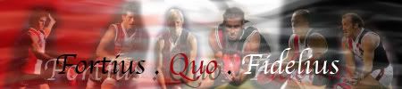
That's pretty damn good, the only problem i can see is maybe if you are to have the Fortious quo fidelius maybe have it a little smaller.
I'm not sure if they are going to do anything about this so i think your efforts might be in vane. Well done all the same
-
Drew.Evans
- Club Player
- Posts: 24
- Joined: Fri 30 Nov 2007 1:00am
- Contact:
it doesn't bother me either way, and my efforts weren't in vain.
I was telling my brother earlier - "realistically why would you change to something which is only moderately better than what you currently have."
Everyone here recognises the current banner so other than the SS sponsorship there is no real need to change. The SS logo after all has become a brand. I think this is a mixed bag.
-
Drew.Evans
- Club Player
- Posts: 24
- Joined: Fri 30 Nov 2007 1:00am
- Contact:
Sorry - i couldn't help it. hehe
slight deviation from previous [smaller FQF]

thicker font.

slight deviation from previous [smaller FQF]
thicker font.
Last edited by Drew.Evans on Sat 26 Jul 2008 12:09pm, edited 1 time in total.
-
i_luv_nick_riewoldt

- SS Life Member
- Posts: 3338
- Joined: Sat 21 Aug 2004 12:15pm
woah they look fantastic! Hoepfully you havent wasted all your time on a project that is yet to be completed!
Drew Evans that is awesum!
Drew Evans that is awesum!
Last edited by i_luv_nick_riewoldt on Sat 26 Jul 2008 1:18pm, edited 1 time in total.
Go saints in '09!
-
Batnoe

-
Drew.Evans
- Club Player
- Posts: 24
- Joined: Fri 30 Nov 2007 1:00am
- Contact:
Drew.Evans wrote:There is a problem with the design however - the guernsey is wrong on Sam.saint edward wrote:Drew.Evans wrote:
Yeah that is exactly what i meant. Brilliant
I'm surprised no one else noticed. hehehe. Either way, as already said - doubt any will be chosen but least it's fun.
Yeah i noticed that, but i think it's better that they are facing rather than one having their back to the other.
saint edward wrote:Drew.Evans wrote:There is a problem with the design however - the guernsey is wrong on Sam.saint edward wrote:Drew.Evans wrote:
Yeah that is exactly what i meant. Brilliant
I'm surprised no one else noticed. hehehe. Either way, as already said - doubt any will be chosen but least it's fun.
Yeah i noticed that, but i think it's better that they are facing rather than one having their back to the other.

-
Drew.Evans
- Club Player
- Posts: 24
- Joined: Fri 30 Nov 2007 1:00am
- Contact: